 English
 German
 French
 Russian
 Spanish
 Japanese
 Korean
 Portuguese
 Ukrainian
 Arabic
 Italian
How should the words on the handbook be designed?
There are always some tips to better help you make your handbook or custom notebooks of your own.
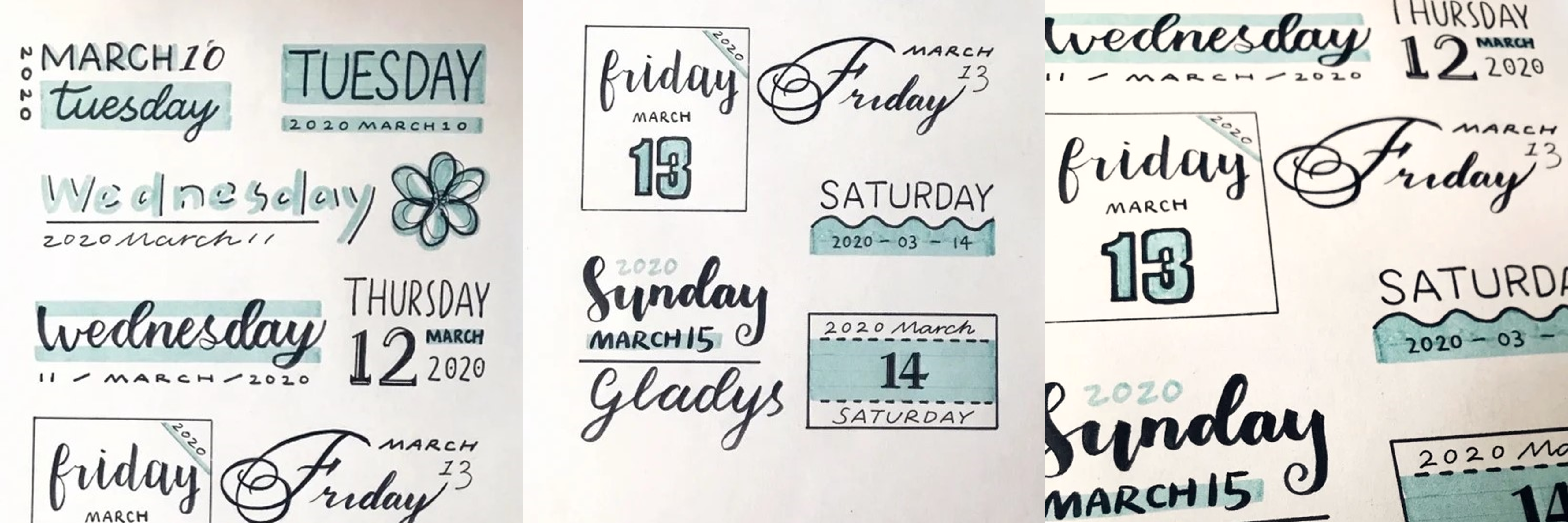
Ⅰ. Shading
One of the easiest ways to make a word three-dimensional is to add shadows, but one thing needs to be noted: just keep the shadows on the same side of the letters. Black words can be added to the colored shadows, the same, colored words can also be added to the black shadows. A simple technique that can never be tired of using
Ⅱ, The background-color
Background can be a box or solid color, or stripes, in different ranks of the word background color should be kept coordinated, generally a content not more than three colors, or there may be color matching problems (unless you are very confident). Also, be sure to draw the background color before you write! Using a scribing pen can quickly complete the painting of the background color.
Ⅲ, The line
Straight lines, dashed lines, wavy lines, if there are branches can be used, of course, the spacing between words and lines should be kept coordinated. Neat lines can make the whole part look tidier, black lines or colored lines are available, the flat part of the highlighter is also used up.
Ⅳ, The border
I like to use the border, writing custom journal books, drawing a border is a basic skill, a variety of border material there are many, here not to write. In the periphery of the font, generally choose a simple line border can be, to avoid a messy picture; can also be combined with lines, so that the overall more organized.
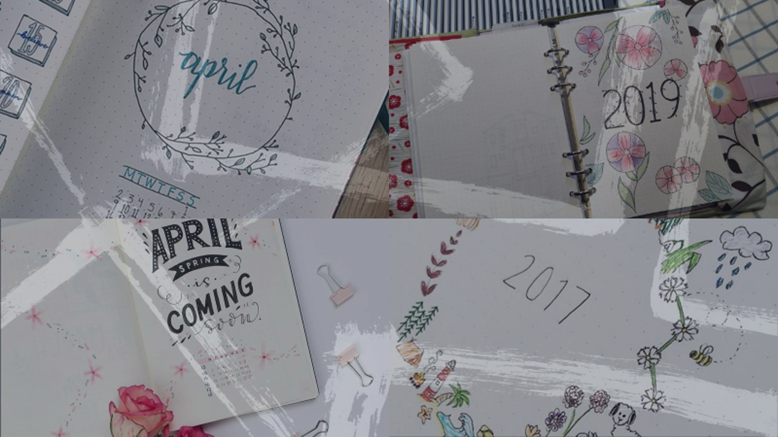
In addition, you can also apply the skills you have learned in Textual design to other books, to name a few. It is also possible to make custom journal covers.
I do hope that these skills will be helpful~
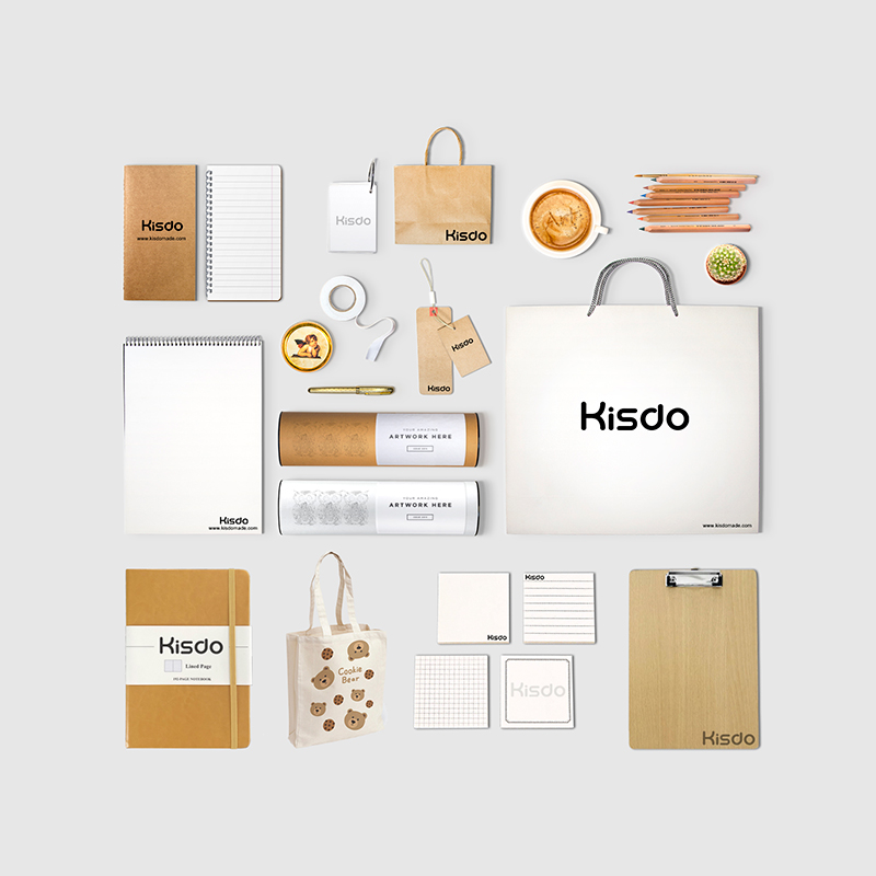
You can also contact us for customization: Custom-Notebook、Custom Journal, that you could create your work.